This week, I had the chance to borrow a different way of seeing the world.
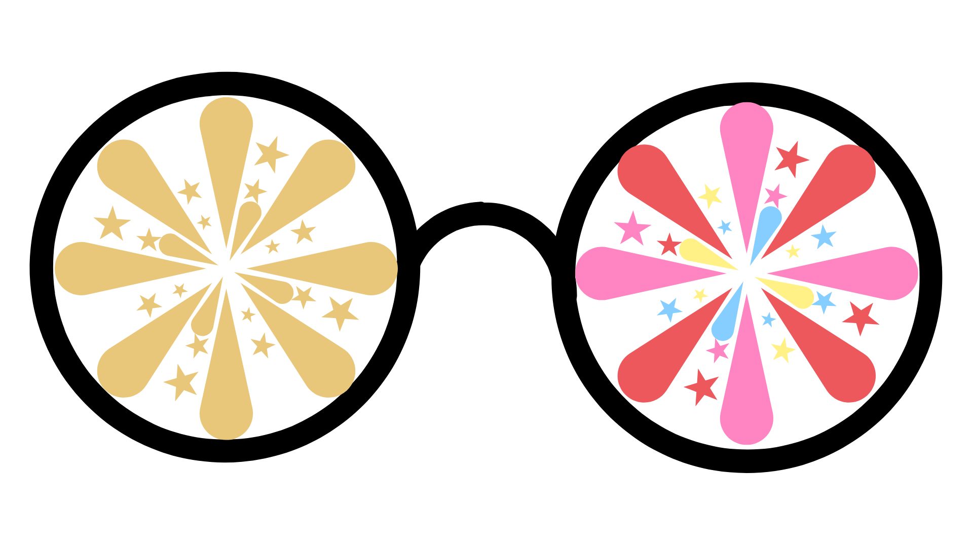
Not a costume or a gimmick. Just a quiet shift in perception, courtesy of funkify.org and the chrome extension to help understand the importance of accessibility. I turned on “Color Carl” filter learn what 1 in every 100 men, and 1 in every 300 women with deuteranopia experience: a red–green color vision deficiency.
I visited a familiar place, an Etsy page filled with the usual bright banners and cheerful product displays. Except this time, the color cues softened into a gentle wash of yellow-green.
Everything stayed perfectly crisp and readable, but the feeling of the page changed immediately. The emotional temperature dropped. And I found myself experiencing something I didn’t expect: a calmer, more neutral, more analytical version of a website I normally navigate through creative emotion.
The strongest insight I walked away with is that color is not neutral.
Color is a message. A cue. A mood. An attention magnet. And when you take it away, the whole conversation between the interface and the viewer shifts.
Research supports this idea. Kaya and Epps (2004) found that colors evoke different emotional responses depending on their hue and saturation. Bright, warm hues tend to create stronger emotional reactions, while muted or blended tones evoke calmer or less intense feelings.
That is what I experienced. When the simulation flattened into nearly a single color family, the emotional layer collapsed right along with it.
The Etsy page was still there, but its personality had faded. Instead of being lured in by bright design choices, I became aware of structure, spacing, clarity, and wording. My brain stopped reacting and started noticing.
Newer research on visual design echoes this. Braun et al. (2025) show that color scales influence the emotional tone of information, even when lightness and legibility stay intact. In other words, two visuals can communicate the same facts, but the emotional temperature changes when the hues change. This is exactly what I experienced. The information didn’t disappear. The emotional script did.
What does this mean for instructional design? This experience helped me see several Universal Design for Learning principles in action.
UDL reminds us that perception, meaning making, and engagement vary widely across learners. When color carries the weight of emphasis, labeling, or persuasion, some learners will miss that message entirely.
The simulation made it clear how easily simple color choices can either invite learners in or quietly shut them out.
UDL encourages us to provide multiple ways for learners to perceive information. That means not relying on color alone to communicate importance.
It also encourages us to support engagement through varied cues so that motivation doesn’t depend on visual features some learners cannot access (like color).
The experience reminded me that accessible design is not about removing beauty or expression. It is about ensuring that meaning is not locked inside a single sensory doorway.
And, again: Color is not neutral.
Hardships I Noticed During the Simulation
I felt like a visitor in this experience and therefore, I was able to frame the experience differently, then if that were my every day perception.
Thinking about living through this lens, it certainly made parts of the page became harder to interpret.
Buttons that normally stand out no longer caught my eye.
The usual color-coded signals were gone.
I had to pause and mentally sort out what was important, what was decorative and what was clickable.
It was not impossible to use the site, but it required more effort and more guessing than I expected.
Revisions I Would Make After This Experience
If I were redesigning that Etsy page, I would give stronger shape cues or icons.
Any place where color communicates emphasis (like the eye candy photos) I would include text highlighting the visuals.
Benefits and Challenges of Practicing UDL
When we design with varied perceptual needs in mind, the learning environment becomes smoother, kinder, and easier to navigate for all students.
One challenge is slowing down long enough to see our work through different eyes.
Ethical Considerations in Accessible Design
This experience also reminded me that accessibility is not only a design practice, it’s an ethical commitment.
Accessible design is a way of saying every learner deserves a clear invitation into the material.
References
Braun, H. C., Mukherjee, K., Gorelik, S. R., & Schloss, K. B. (2025). Affective color scales for colormap data visualizations [Preprint]. arXiv. https://arxiv.org/abs/2511.14009
Kaya, N., & Epps, H. H. (2004). Relationship between color and emotion: A study of college students. College Student Journal, 38(3), 396–405. https://enktesis.com/images/52frames2021/Week_20210308_11_Color_Relationship_Kaya_Epps_2004b.pdf